[ad_1]
Take it from a legally blind photographer, camera tester, and blog editor; Sony’s Accessibility feature in their recent cameras is a genuinely good attempt at helping us. But it also seems like they didn’t really talk to visually impaired photographers for feedback. With mirrorless cameras came a lot of very big improvements for those who have a hard time seeing. And it’s wonderful that photography is more accessible to us now. We’ve featured and talked to a ton of photographers who’ve overcome visual impairment. But, I can tell you from firsthand experience that there’s a long way to go.
View this article with minimal banner ads in our app for iOS, iPad, and Android. Get no banner ads for $24.99/year.
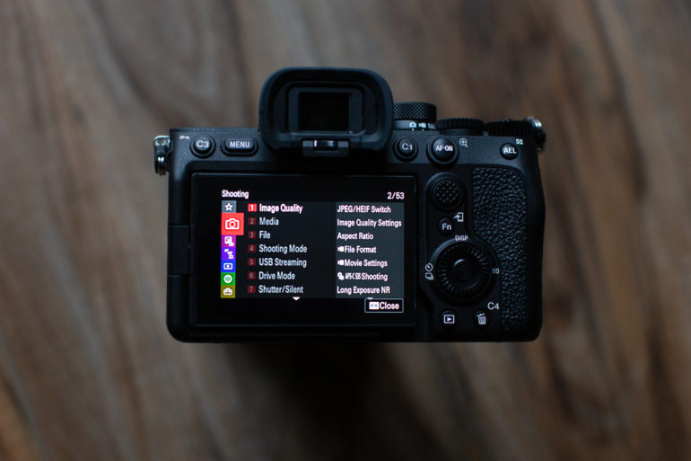
Many of you probably don’t even know what sort of feature I’m talking about. The reason for that is because Sony’s newest cameras more or less bury it in the menu. This, already, is pretty hostile to visually impaired photographers. For a visually impaired photographer like me, diving into Sony’s menu system is like paging through old Encylopedia Brittanica books without any sort of logical table of contents. You may be saying, “Well it’s fine for me.” And I assure you, you’re either a Sony cultist, aren’t familiar with other camera systems, or not visually impaired. I shouldn’t need to create a My Menu shortcut or anything like that if I’m visually impaired.
Now, let’s discuss what this is exactly. The accessibility feature reads the contents of the menu screen to you, but it does so in no logical order. I mean, think about it. If an AI wanted to read this menu to you, how would it do it? And further, how would you go about figuring out what to do if you’re visually impaired. What Sony’s accessibility feature does is read aloud basically everything on the screen to you in no logical order. So if you want to tell the camera to change aspect ratios, how would you do it? Well, you’d probably think to use the touchscreen to go to that menu selection. The problem is that the touchscreen isn’t that useful. Sony’s older menu system could’ve worked if it were touch-capable. But now, there are small words and text that are pretty aggressive if you’re a visually impaired photographer. What’s worse is that the camera can’t listen to you speak if you want to talk back to.
Think about this as calling a phone number that tells you to use voice prompts. It would present a menu, then a sub-menu, and then further submenus. And if you want to return to the main menu, you could do so easily. But instead, the Sony Accessibility feature doesn’t work that way.
Further, Sony’s small text makes it difficult to interact with the menu. If you’re colorblind, then I truly feel for you.
So what’s a better system? Well, luckily, we’ve got lots of photos of other camera system menus.
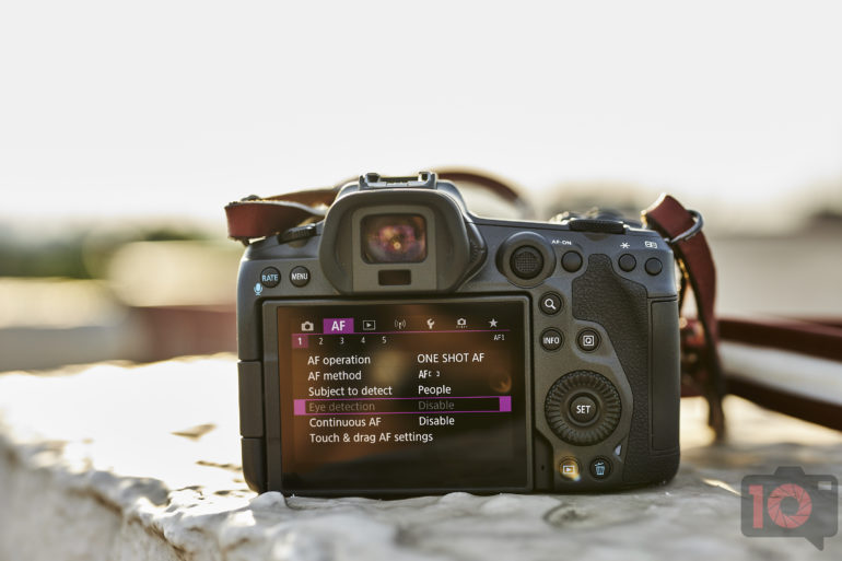
Here’s Canon’s menu system. It could be made better for visually impaired photographers by making the overall text bigger. But it’s well color coordinated and you can get to anywhere you need by touching the screen twice. Canon’s menu is by far the best out there.
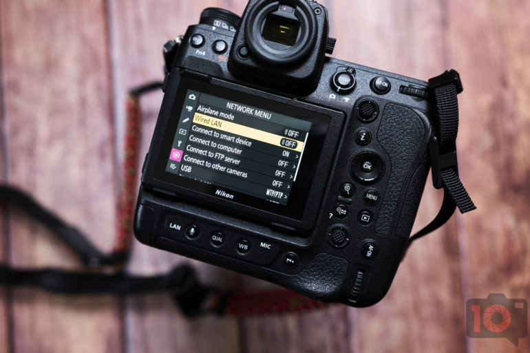
The menu on the Nikon z9 is pretty good. Nikon has a very useful info button but there isn’t much else to help visually impaired photographers. Still, this is a better menu layout than Sony’s.
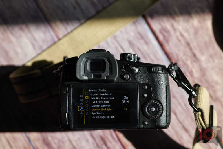
Here’s Panasonic’s menu system. It’s a close second to Canon’s and pretty easy to navigate by touch. But it’s still just as good as Canon’s.
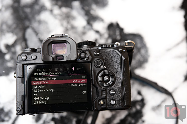
Here’s the menu on the new OM System OM1. If this were made touch-capable, it would rival Canon’s. The text is big, it’s color coordinated, and it’s easy to navigate. It’s far better than Sony’s approach.
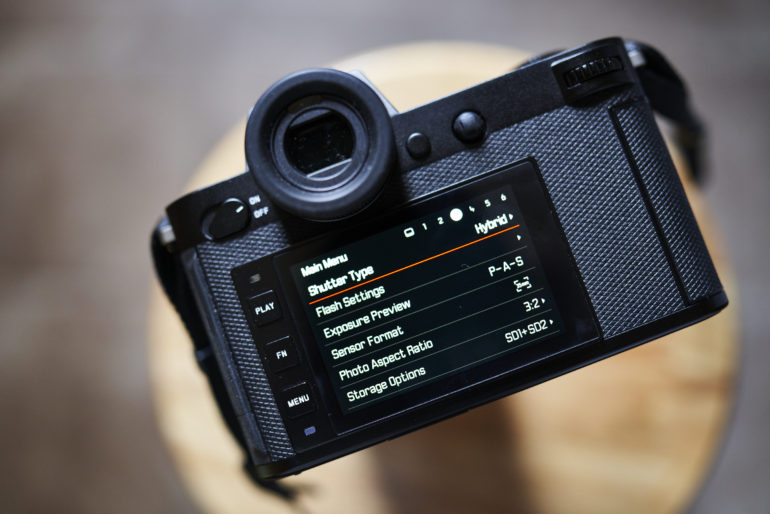
Here’s Leica’s menu. This should’ve been a touch menu as it would’ve been nearly perfect. It’s a shame that it isn’t.
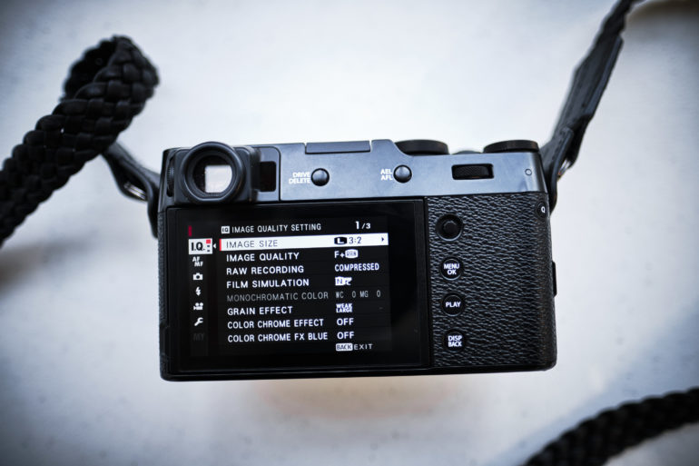
And here’s Fujifilm’s menu. It’s better than Sony’s, but still needs improvement.
In the end, I applaud Sony taking an approach to help visually impaired photographers with their accessibility features. But they need to go a lot further.
[ad_2]
