[ad_1]
OPINION: It’s no secret that Dell XPS laptops have been consistently excellent for the last half decade. Numerous models, including last year’s Dell XPS 13 OLED, earned a perfect 5/5 scores when we reviewed them.
Which is why I was outright flabbergasted to see Dell not only took a risk updating the laptops’ already best in class designs at CES 2022, but from what I’ve seen, also managed to actually improve them with a new Dell XPS 13 Plus model.
Cliff notes: The keyboard has been expanded to have next to no visible border, making the keys larger and, in theory, more comfortable to type on. The function keys have been replaced with a new capacitive touch strip and its internal components have all been upgraded. Highlights include a 12th Gen Intel CPU, Xe Graphics and LPDDR5 RAM.
These are top end specs that means the laptop, based on our experience testing other devices, should blitz through every day tasks and be capable of basic creative work and lightweight gaming.
If that wasn’t tempting enough, it also has top of the line OLED and 4K resolution screen options.
This left me salivating at the prospect of getting a new XPS 13 Plus in for testing, with its specs and design already making it look like one of the most promising laptops set to arrive this year.
That’s especially true when you look at what’s happening on the other side of the fence with Dell’s arch-rival in the top end laptop market, Apple.
Don’t get me wrong, 2021 was a great year for MacBooks, with Apple unveiling its second wave of M1 Max and M1 Pro CPUs in its latest MacBook Pro 2021 range. This was a big boon for creative or power users that need serious computational power.
But for me, they’re not enough to overcome two issues I have with MacBooks. First, they don’t look great, especially compared to what’s on offer in Windows. The MacBook Pro doesn’t look terrible, but for reasons’ unbeknownst to me, Apple has added a massive notch housing for the front camera that makes the new Pro look outright horrible.
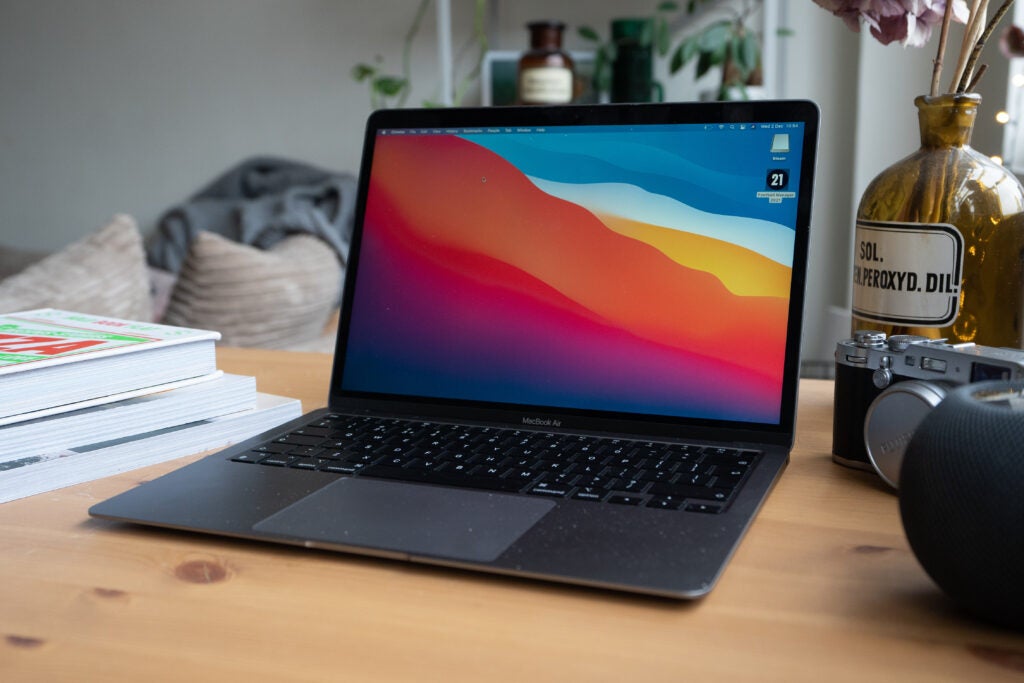
Go down to the cheaper MacBook Air, which is the XPS 13 Plus’s direct rival, and things get worse. Sure, there’s a version with an M1 chip, which as we said in our MacBook Air M1 review, is a stable workhorse, but the design is outright archaic. Look at the below image. Wasted space around the keyboard and a giant bezel around the screen – it looks like a 2017 mid-range Windows laptop.

Sadly, according to industry rumblings, Apple is not planning to change anything this year. Instead, recent leaks suggest the MacBook Air will be updated to look more like the new MacBook Pro, which is exactly what I don’t want.
This is a real shame as when I was growing up, Apple was the top dog for laptop designs. I still remember outright squealing with delight when I got my first iBook G3; the plastic, pebble-like design made the chunky, grey Dell laptops of the time look outright dull.
As a result I can’t help but think that if Apple really wants to compete with Dell on a design front this year, it needs to do better.
[ad_2]


