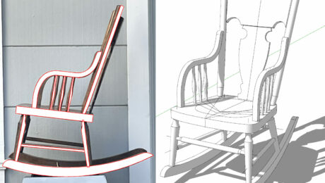
Recently our class at school (Building Classic Furniture) chose Windsor chairs as the next project. I already had several SketchUp designs of Windsor chairs, but needed a way to show alternative side chair designs for student selection. I was facing a mix of student skills. For example, some students are very skilled in lathe turning, others had little experience in turning. Many of the options apply bamboo style turnings as this style is much easier for beginning lathe turners.
Therefore, I looked for a way to show chair alternatives along with a level of construction difficulty. Of course SketchUp and Layout were my chosen tools to create this document.

Here is the two-page document. The first page is in perspective. The second page is orthographic with a Front, Top, and Side view.

Here’s the procedure I used in producing these two pages.
- I copied the chair assemblies from their respective SketchUp files, and placed them into a new SketchUp file.
- I lined up the six assemblies along the Red Axis and created one Scene in perspective with shadows.
- I then made a Front Orthographic Scene of this same set of assemblies without shadows.
- A new Orthographic Scene of these same assemblies was made in a top view.
- I copied the six assemblies and moved them down the red axis. Then I rotated each one 90° to have a Side view.
This resulted in a SketchUp file with 4 Scenes. I clicked on the File/Send to Layout function.
- In Layout I placed the perspective Scene on Page 1. Then added the labeling.
- In Layout I created a second page and added the three Orthographic Scenes. And again I added Lines and Labels.
Here is some of that work in the shop.

More by Tim Killen
 |
Best photos for SketchUp |
 |
Big piece with many small details |
 |
Creating a cutaway view in SketchUp |


